A RUMSON HOME MARRIES QUIRKY COLORS, TASTEFUL MATERIALS, AND CUTTING-EDGE INTERIOR DESIGN
BY ERIK SCHONING • PHOTOS BY CHRISTOPHER JAMES PHOTOGRAPHY
A great house can be compared to a classic Beatles album: there are competing concepts and everybody involved has a slightly different opinion, but when it all comes together, it just works. A stunning manor in Rumson came together this same way. The homeowner had previously worked with all parties involved: Town & Country Design Studio, the mother-daughter duo of Sue Comfort and Maddie Kupecky at Comfort Designs, and builder Eric Seebald of Seebald Construction. It was just a matter of getting the band together.
“It was a beautiful home to begin with,” said Comfort. “But the homeowner really wanted to implement her personality and style. She’s not afraid of color. She’s not afraid to think outside the box. It was a designer’s dream.”

Dream is the operative word here: the house has an enchanting quality to it, a touch of refined whimsy. Initial design meetings were held in December 2019, but only this year has the work been completed, the dream made real. This whimsical sensation greets guests right from the entryway in the form of a beautiful navy blue basket chandelier, an emblem that lets one know things work a little differently in this house.
“We actually got that chandelier for another home,” said Comfort. “For a number of reasons we didn’t go through with that project. The homeowner saw it and loved it. That was the first thing she said to the electrician: ‘I don’t care what you do, we have to make this light work.’”
Moving through the home is like touring a museum; every room demands attention. Just across from the foyer is a sunlit entertaining room with leopard print accent chairs, a second chandelier, an abstract painting, and bold, dark blue walls. There’s an endlessly vibrant lemur print wallpaper in the washroom. Did we mention the glossy hot pink TV room?

Amid all the mirth, the designers always kept in mind that a home is, above all else, for living. The master bath is a perfect example of restrained personality. The stained wood double vanity was custom designed by Town & Country and fitted with Belwith Keeler hardware. The knurled cabinet handles were designed to match the contour of the faucets. Everything works carefully in concert.
“We took a lot of time designing and detailing this vanity,” Town & Country’s Christine Bolton said. “Figuring out the geometry of how it would work with the mirrors and the faucets and the space. You can see the legs are tapered. It’s a good hybrid between masculine and feminine, so it’s really nice for a his-and-her bathroom.”

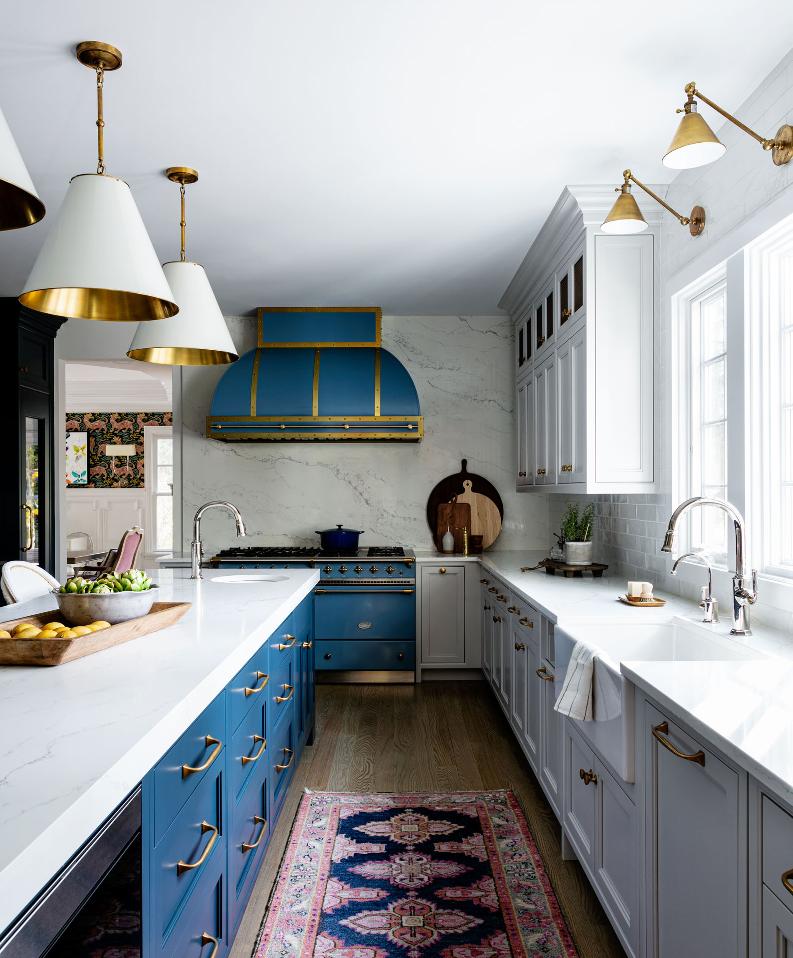
Sooner or later you’ll settle in the kitchen. It’s hard not to the stunning Lacanche range, custom ordered by the homeowner, is big and bold enough to generate its own gravity. Once the range was decided on, the design process fell into place.
“Typically, if a client is going to go with a Lacanche, that ends up fueling a lot of things,” said Bolton. “We knew the cabinets were going to be much more subdued and muted. We just wanted to find a really beautiful deep blue that would work with this brighter color on the range. It was a big challenge. You have to be careful not to get too literal with color.”

The solution a two-tone kitchen, playing the sapphire range against blue and gray cabinetry is a study in compromise. As with other areas of the home, there is a real tension between letting loose and a sense of restraint. The range adds flair; the cabinetry adds composure.
Try not to miss the details in this room. There’s the burnished brass cabinet hardware from Water Street Brass, echoing the unlacquered brass on the range.

There’s the walnut butcher block countertop from Grot house, plus clever brass tubular shelving with glass shelves from Palmer Industries. Here, as in the master bath, the cabinetry was done by Town & Country.
Across the island countertop is a pair of tall cabinets flanked by mirrors. Behind each mirror is the fridge and freezer, respectively, and behind those cabinet doors is a gorgeous walnut workspace. This workspace was a dream of Sue Comfort and her daughter Maddie Kupecky: they had wanted to build it for years. The homeowner loved the idea.
For such a spacious kitchen, there is a sense of economy that is charming: nothing sprawls, everything seems to simply tuck away. Everything in the home gives the impression of falling into place. According to Bolton, that was no accident.

“When you have the right people involved, the right businesses, personalities, client, everything, it all lines up,” said Bolton. “All egos were left at the door. Of course it’s the client’s vision. We just saw it through. But it worked because of who everybody is.”
Town & Country Design Studio
25 Bridge Avenue #100, Red Bank 732.345.1441
townandcountrydesignstudio.com
