A DESIGNER WAS TURNED LOOSE IN THIS FOUR-FLOOR SLOPE BROWNSTONE TO INDULGE WILD COLOR CONTRASTS, UNEXPECTED SPACE ALLOCATIONS, AND NOVEL METHODS OF TAKING ADVANTAGE OF AREAR WALL OF WINDOWS
“Go crazy… be wilder… don’t hold Back,” were the surprising and ongoing requests from a young Park Slope couple to the interior designer of this 3100-square-foot brownstone. Further suggestions were to indulge in unconventional flights of color fancy, interior layouts that veered decidedly into the unexpected, and to frame the experimentation—literally and figuratively—around what is essentially a rear facing wall composed almost entirely of glass. While such apparent license to think unconventionally and artistically might seem an opportunity any artist would fantasize over, for Jessica Helgerson Interior Design and its namesake principal, it offered both thrill, and pause.“We tend to be fairly restrained in our design, in that most of our clients simply want it that way,” Helgerson said. ”But one of the owners of this home, who is a painter herself, kept having to prod us with ‘Take more chances!’ That is a fun thing to have a client tell you.”
In terms of floor breakout, the brownstone is classic Brooklyn traditional. Four floors, each with 775 square-feet, but the building had been derelict for a number of years before a construction company rehabbed it completely. In the process, they introduced unquestionably its most striking aspect, a rear facing wall that was turned into a powerhouse of natural light, along with a build-out patio. There are three bedrooms on the top floor, along with one more on the basement level (that same level sports a rentable apartment). The designer knew one of the challenges posed by a relatively small entryway level was that she was not going to be able to accommodate kitchen, dining room, and living room on one floor. She offered what turned out to be a fascinating alternative: a basement level that function as an expansive—and partially high ceilinged—living room.“Once we came to the conclusion that you just couldn’t fit all that into the main floor with a separate family room, things all got better,” Helgerson explained. “It’s somewhat non-traditional, the way you walk in and are immediately in the dining room, but we made efforts to demarcate different spaces on that level by, for example, placing a small sofa in between. That’s actually one of my favorite pieces—it provides a way for people to sit and chat while food is being prepared. And a basement level living space turned out to be an absolute natural.”In fact, the designer pointed to the term “basement” as being insufficient to adequately explain what the space has turned into. Not only is it awash in floor-to-ceiling window light, it’s decked in a fascinating series of color contrasts that are miles away from the knotty pine and cement floor memories of suburban lower level living spaces.
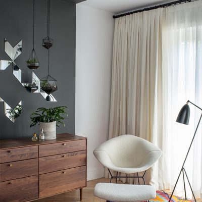
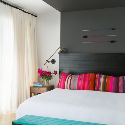
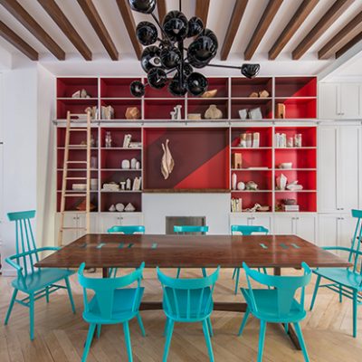
“The clients love to travel, and wanted some of the space to be a collection of things they found when they were abroad,” added project designer Chelsie Lee. “That was part of the inspiration behind those bright Peruvian blankets, and they definitely fit our clients wish for vibrant color.”More color pops in the kitchen are, in part, the result of the vintage Paul McCobb chairs surrounding the dining room table—lacquered in turquoise—as well as the bookshelf wall, painted in a geometric pattern of four shades of red.One year from first consultation to completion, the project was assisted by a relatively clean slate as far as client-brought furniture and other possessions were concerned. It gave the firm an opportunity to do things such as design a dining room tableemphasizing yet more bright hues, and selecting furniture designers that emphasized the high-contrast palettes throughout, such as the Ligne Roset Ruche loveseat and David Weeks light fixture in the dining room, and the mid-century style dresser from Design Within Reach and Bertoia Diamond Chair in the master bedroom.
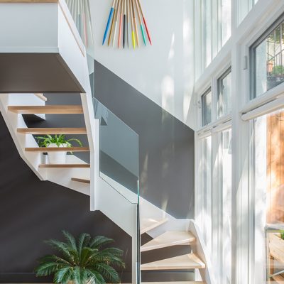
Selection of artists was a pivotal component, one also offered to the designers for consideration. The wrapped arrows work in the stairwell is by Brooklyn artists Fredericks & Mae, while the collection of earthy wood, ceramic, and glass objects was handmade by Brooklyn and Portland, OR artists, including Laura Buchan and Michelle Quan. One particular artist’s contribution helped make the pivotal lower level a reality.“I have a friend named Heather Watkins—she works on big, beautiful paper, and does a lot of things with twisted rope,” Helgerson said. “She’ll drag the rope around on the paper or manipulate the rope on the paper so it leaves a trace. We had originally thought in the lower living room to do a bunch of dark and fairly traditional oil paintings, but the client just wasn’t feeling it. Heather’s work kept the darker tones of the room intact, while adding this extraordinary texture.”The result, to the designer—both in the living room and in the home as a whole—is a dance of vibrancy and subtlety she is unafraid to declare herself proud of.“It was wonderful to be energized by the push-pull nature of those two, seeming polar opposites,” she added. “This is just one of those wonderful projects that came out exactly right.”


